
Tom Adams' Archives Uncovered (Part 1)
- David Morris

- Nov 1, 2025
- 9 min read
Updated: Nov 15, 2025
Tom Adams: The Art of the Artist. An original retrospective into Tom Adams' iconic Agatha Christie book covers was presented on Thursday September 18th, 2025 at the International Agatha Christie Festival in Torquay, Devon. The talk focused on my findings from researching within Tom Adams' personal archives. It was accompanied by an exhibition at Torre Abbey museum titled Tom Adams & Agatha Christie: Partners in Crime. In addition to giving the presentation, I assisted with the curation of the exhibition which was designed to present many of the items I discussed in the talk. Because of the length of the talk and number of images to share, I am sharing an online version of the presentation across three instalments (links to the 2nd and 3rd instalments are below). I've edited the content be more suitable for those reading online versus an in-person talk. In addition, I am sharing the actual slides used, so they are likely best viewed on a computer rather than a phone. I hope that by sharing the actual content presented it will give those who haven't attended a Festival in-person the motivation to go at least once as the Festival is packed full with dozens of events that provide unique insights into the world of Agatha Christie.
To read the review of the Exhibition: (link)
To read Tom Adams' Archives Uncovered - Part 2: (link)
To read Tom Adams' Archives Uncovered - Part 3: (link)
Introduction.
The goal is to share insights into Tom Adams – the artist – and how he created the artwork for sp many Agatha Christie’s books published in the UK and also in America. These insights have come through a study of Tom’s archives which I was generously given access to by his widow Georgie Adams – a noted author in her own right. I selected key items from within his archives that communicate effectively the different ways he created his art.
A Brief Biography.
Tom was born in 1926 in Providence, Rhode Island, into a family of distinguished Scottish architects and town planners. His family moved to Kent when he was six, and he later trained at the Chelsea School of Art and Goldsmith’s College, after a stint serving on Royal Navy minesweepers at the end of the Second World War.

Tom worked in commercial art, from pub signs to comic strips, and co-founding Adams Design Associates in 1958, his breakthrough in the publishing world came when he received a commission from Jonathan Cape for the book by Malcolm Ross-Macdonald;
But it was the cover Tom created for John Fowles’ novel ‘The Collector’ that established his reputation and would soon define a new style of paperback artwork for a generation.

His cover was universally praised, bringing him to the attention of Collins’ art director, Patsy Cohen, as well as Mark Collins, director of their Fontana paperback division. It led to a partnership that lasted almost 20 years with well over 100 different cover designs.
Many of you will already be familiar with Tom’s work, and may have your own favourite covers. There have been two books published that present his artwork for readers to enjoy, but neither delved deep into his actual artistic processes which is what I hope to do today.

The Artistic Process.
But let’s start with where he created his work – Over the years Tom lived and created art in a variety of places. In the 1960s he was in London, then in the 1970s he moved into Marden Hill in Herefordshire, where many other creative people lived and worked together, before finally moving to Cornwall in 1999.

But how did Tom go about creating covers? Well I’d like to quote from Agatha Christie’s The Labours of Hercules first:
Hercule Poirot was plunged headfirst into a bewildering sea of classical lore… For two hours Poirot read diligently, making notes, frowning, consulting his slips of paper and his other books of reference.
As I delved into Tom’s archives, I found a lot of similarity between Tom’s approach and Poirot’s.

In an interview with Tom for the 2013 ITV documentary ‘The Mystery of Agatha Christie’ he told David Suchet: I would read the book at least three times. I would make notes, do sketches, underline certain passages, certain objects, which would be true to the story but not necessarily illustrate the story, but an object that would symbolize or represent a theme in the book.
Just as Poirot had his slips of paper, so did Tom. Here we see some from his work on The ABC Murders.

Setting the Scene.
The first Christie cover he created was for ‘A Murder is Announced’ published in 1963 by Fontana. While no archival material exists for this cover, we know from a recorded interview with Tom that Mark Collins wanted him to take the covers more seriously than earlier editions had.

Tom did this exceptionally well yet was able to do so through a variety of different styles. This first cover is a good example of a style he used often - one I’m calling ‘Setting the Scene’. These are the covers that lean more heavily on either the use of a core physical item, or the assemblage of multiple physical items to create a scene that is then photographed to create the design sought. So, let’s run through a few examples of this style.
I also want to note that all Tom’s art was created manually – nothing was ever done on a computer.
His cover for Lord Edgware Dies was published in 1965 – reminding us that murder isn’t always cozy. This bloody cover was really quite revolutionary compared to the paperbacks that had been published for the prior 20 years. But how did Tom create this image – by repurposing a small 3 inch letter opener that he owned. His ability to create the scene with simple, and oftentimes household objects would define many of his covers.

Another example is The Big Four from 1972, but here he avoids the sensational while still conveying a sense of the sinister. In this cover, Tom integrated one of the two Lewis chess pieces that he owned. You’ll also notice here that the chess piece appears to be a mirror image of the actual piece.

Many of his images are in fact reflections of his source material because he often used tracing paper that was inverted as part of his creation process, something we’ll discuss soon.
So let’s run through a few other designs that really focus on a single key element.
A number of his covers showed a weapon, but without a corpse. Here is the 1972 cover for Partners in Crime. Tom’s studio photograph shows us how he created the perspective he wanted – first photographing the dagger and then rotating the image until he had the aesthetic he sought.

His skill at trompe l’oeil is really evident in this cover for The Mysterious Mr. Quin from 1965. Again, his studio photograph shows us how he set the scene.

But how did he convert this photograph to his artwork? So let’s pause here to talk about his craft of the actual drawing and painting. I’m going to read to you a summary that his son, Jonathan, shared with me:
1. Once he had established the scene he would then do a highly detailed pencil drawing, usually on illustration board or occasionally on wood panels and in one case on dental plaster. This was the base layer of the painting and I often thought these drawings were so incredible that it was a pity that they were then covered in paint! That was until I saw the finished painting.
2. With the pencil drawing complete (often taking almost as long as the painting), he would then spray it with fixative to prevent the graphite smudging.
3. Then he would apply a series of washes, often in Pelikan Indian inks. These provided the vibrancy of colour he required while being transparent and so leaving the pencil detail visible.
4. The next stage was to build the solidity of the prominent elements of the image with, in the early days, oil or gouache, then later with acrylic. This created wonderful spatial depth, the transparency and sheen of the wash receding into the distance and the more opaque solidity of the oil-painted objects projecting into the foreground, seemingly bulging out of the paper. Indeed, when Tom painted something like a Death’s-head moth, a flower or a gun, viewed from the regulation one meter distance (as used by museum designers), these looked so real you felt you could lean forward and pick them up.
5. He also created in a context of abstraction like Three Act Tragedy or Daliesque surrealism like Destination Unknown. To produce the required abstraction, he used various techniques of mixing colours of different types that precipitated and so produced swirling textures or ‘tonking’ that created complex textures he used for backgrounds.
6. The final layer was more varnish and the job was done. This was the magical process I watched him apply on many of the Christie covers when I was 12 or 13. Later, when I was working on my O level and A level art he showed me these techniques in more detail (he was a terrific teacher). I later applied the same approach in my own artwork.
In addition to freehand drawing directly onto his illustration board, one of the tools Tom used as an aid was an ‘episcope projector’ that could project a photograph or other image onto his illustration board, allowing him to efficiently retain the correct dimensions and structure.

So let’s look at some more covers now that we understand many of these core steps in his process. Here’s another studio photograph. For Death on the Nile (1968), you can see how Tom placed a rod into the gun’s barrel to hold it in the air, hiding that rod by placing a white background only behind the gun. He then rotated the image before creating the cover.

And this was the finished cover - an iconic image.

Another example of Tom’s creativity in supporting objects can be seen in the studio photograph for his second cover of The Murder at the Vicarage. Here you can see the supports holding the sheet of paper aloft creating the illusion of it floating.

The last example I want to share of a photograph showing how he created the scene is this one - the 1964 cover of Murder on the Orient Express.

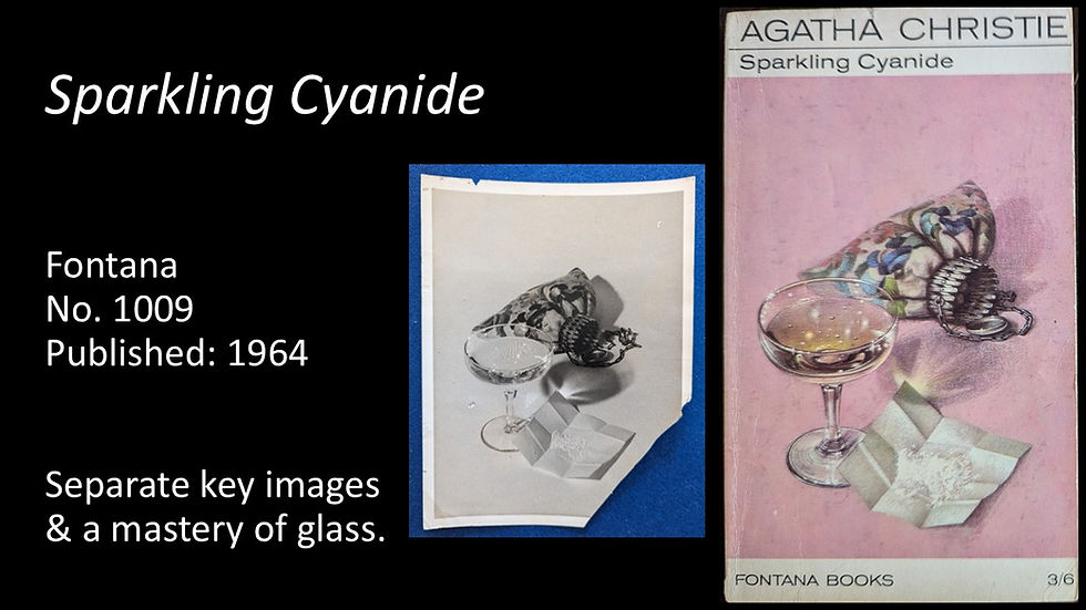
Painting Glass.
While still examples of 'Setting the Scene', I do want to highlight a couple of paintings that demonstrate one of Tom’s exceptional skills which was painting glass. Here we see the studio photo of the scene he created for the 1965 cover of The Moving Finger.

Here’s another studio photograph of a design he created where his final cover again showed his skill painting glass. Here it was for the 1964 cover of Sparkling Cyanide.
Angles & Lighting.
Within Tom’s archive were many examples of studio photographs showing how he experimented with angles, lighting and backgrounds until he found the design he sought.
We’ll run through a few examples here – and I’ll show the photos first to see if you can guess the book. Here you can see different lighting and backgrounds being tried, as well as Tom framing the image with masking tape.

The book is the 1971 cover for Five Little Pigs.

Here’s another example of Tom’s experimentation with angles and lighting. You might think it’s for The Clocks…

But it was for the 1967 cover of The Seven Dials Mystery.

For the next cover, not only do we see photos showing how Tom tried different lighting for the hobby horse he would use on the cover – but we also see some other source images – including the greenhouse from his home at Marden Hill, but also a photograph of his father as a young boy. These images were all assembled together in a form of collage to create the cover for Postern of Fate – this cover first published in 1976.

Skulls and skeletons were also used multiple times on Tom’s covers. Within his archives, one of his photos was taken from far enough back that we can actually see his studio set up and lighting aids. Several images were taken of this skull at different angles – two samples are shown here – one of which was ultimately used on the book.

This art was used on the cover of one of his earliest images – The Hound of Death from 1964.

Twelve years later, studio images in his archive show that he was still experimenting with angles and lighting – though here he was using quite a large skeleton! Any guesses on this cover?

This formed part of the cover for the 1976 printing of The Labours of Hercules. You can see here many elements are in the cover making it far more complex than some of his earlier paintings.

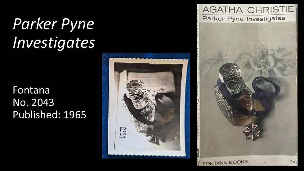
Lastly in this category of lighting and angles is a collection of many images of this glass decanter – each was labelled differently – though there were no notes as to the meaning of the labels. The decision to select a multi-faceted glass decanter was a courageous choice that Tom certainly knew would test his abilities to paint glass.

This is the 1965 cover for Parker Pyne Investigates and his skill capturing the decanter is exceptional.
Future Instalments.
There are two more instalments to share which will be published over the next few weeks. They will cover his use of human models, more insights into his American covers, his use of complex collaging, and also his creative art - designs he created organically.
Input.
Comments are most welcome - either by adding them at the foot of this article or by email at: collectchristie@gmail.com . It would be great to hear what you've enjoyed learning about or seeing in this article. Also, if there are any specific covers you have questions about do let me know. Many were not covered in the presentation due to time constraints.
Subscribe & the Socials.
If you are not a subscriber to my website, please consider subscribing here: link. This ensures you receive an email any time I write and post an article. Re: Social Media accounts - do consider following me on X (formerly Twitter) @collectchristie , on BlueSky @collectchristie.bsky.social and on Facebook. The content on X and BlueSky is usually identical, but will vary on Facebook. I am also now on Instagram. All should be of interest for any fan of Agatha Christie.
Happy Collecting!


Comments