
The New Tommy & Tuppence Editions (Artist: Paul Oakley)
- David Morris

- Jul 12, 2025
- 9 min read
Updated: Jul 13, 2025
In 2022, Agatha Christie fans celebrated the Centenary of Tommy and Tuppence who first appeared in print in 1922 in The Secret Adversary. These two characters appeared in five Christie novels (though one is more of a short-story collection) over a period of approximately 50 years. Unlike most of her characters, Tommy and Tuppence were allowed to age concurrently with their books. There was a notable absence of them both from Christie’s canon between Partners in Crime (1929) and N or M? (1941), and even longer if one considers that the Partners in Crime stories were written in the early 1920s before being collected into a novel. While there are both fans and detractors of these characters, I have always been a fan. Thus, I am pleased not only to see efforts being made to freshen up the appearance of the published books for new readers but also to await the new six-part Britbox series that will reimagine the characters in the modern world (fingers crossed!).
The New Editions.
A new series of Agatha Christie paperbacks featuring Tommy & Tuppence Beresford was recently launched in the USA. The books are published by William Morrow, the American subsidiary of HarperCollins. Four of the books in the series were published in 2024, while the final title was published in 2025.
The Tommy & Tuppence Books
No. 1: The Secret Adversary. Published on 13 August 2024.
No. 2: Partners in Crime. Published on 15 October 2024.
No. 3: N or M? Published on 12 November 2024.
No. 4: By The Pricking of My Thumbs. Published on 17 December 2024.
No. 5: Postern of Fate. Published on 14 January 2025.
Cover Art & Design.
The cover art for these books was all created by Paul Oakley, a talented illustrator and artist based in the UK. The layout design is by Richard Aquan. As an advocate for recognition of the artists who create book covers, I reached out to Paul to see if I could learn more about him and as his approach to creating these covers, as well as learn about how publishers and artists collaborate today to continue to drive demand for Christie novels. This article focuses mainly on how these Christie covers were actually brought to life by Paul Oakley. I hope you enjoy learning a little more about the creative process.
Paul Oakley – Professional Illustrator.
Paul has been a professional illustrator for over 25 years, working within the publishing, editorial, and advertising fields (self-portrait below).

Previously, his work for publishers had been more focused on women’s and youth literature. While he created some crime covers for HarperCollins over a decade ago, the only crime titles he can specifically recall creating art for are for The Infamous Frankie Lorde series which are three teen novels by Brittany Geragotelis.
As with many professional illustrators, you may know his work even though you are not aware of him specifically. For example, Paul’s work was used by McDonalds on every piece of their packaging throughout the world about a decade ago. He also has created illustrations for various sporting events and major drinks brands – just to name a few industries.


The Creative Process.
Paul indicated that he was approached by Richard Aquan, designer for HarperCollins, as they needed an illustrator to create covers for new editions of Christie’s Tommy and Tuppence books. The initial goal was to differentiate these titles from the Poirot covers simultaneously being published featuring art by Stephen Millership (see this link for my article on those covers).
For Tommy & Tuppence, the publisher’s objective was to have the main focus of the design be silhouettes of the couple in different poses. This made Paul a suitable match since his work as a graphic illustrator is suited to reducing the art to just the most important details, with other elements and environments only hinted at.
Paul’s knowledge of Christie has come primarily from television and film adaptations. After receiving the commission he realized he had watched the BBC adaptions of these stories years ago – with James Warwick and Francesca Annis in the roles of Tommy & Tuppence. Prior to designing the illustrations he did a lot of research on each of the novels, especially reading reviews to get a better indication of how they have been received.
The Secret Adversary.
Since Paul was advised that the books were to be released both sequentially and target publication dates were provided, the initial work was solely on The Secret Adversary. The first step was to create just the Tommy and Tuppence silhouettes. While the brief was basic – a running couple - the main testing at this stage was with the clothing of the era. The illustrations below show six of the unchosen initial designs – all varying slightly.

The silhouette approved by Agatha Christie Limited (Christie’s estate) is seen in the images below. Paul states that once the approval was given, the difficulty was how to make the overall illustration work within the constraints of the book design. The artwork needed to be placed within a fairly tight space due to the large font being used for Christie’s name as well as the title. It was important to try and give the figures life within this space and not become too repetitive over the series. For this first novel, several simple backgrounds were tested - both abstract art deco styles as well as street options. Below you can see two of the abstract styles along with the final chosen design as it appears on the published trade paperback.


Paul brought to my attention that how one uses light gradients on a cover can have a significant effect. For mystery fiction in particular, he stated the use of light is an important element. As you can see in the final design above, the lighting on The Secret Adversary suggests that it may be coming from a car or perhaps people with torches. In all the other covers note how he uses light gradients to influence the overall aesthetic.
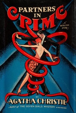
Partners in Crime.
Once the design for The Secret Adversary had been finalized, work moved onto the next book. For this and the later books, the overall briefs remained relatively simple focusing on the preferred pose for the silhouettes. For the second novel, Partners in Crime, the brief from the publisher was to have them dancing. As with other covers, multiple designs were created. Below are two alternative designs that were not selected.

The publisher’s request to have them dancing was likely an homage to the original 1929 American cover that adorned the first edition. While this is speculative on my part, it is known that Stephen Millership’s recent cover for The Seven Dials Mystery also paid homage to the original 1929 American cover for that book. Thus, I expect this was deliberately guided by the publisher. Below is the final design selected for the trade paperback, plus that original 1929 American cover (with the wrong hair colours!). Note that this is the only new cover where Tommy is not in his hat and Tuppence is without her handbag (consistent with the original design).


N or M?
The brief for N or M? was that the characters are separately reaching & bending, as is searching for items. A shift in the design objective was also made to be a bit more descriptive of a location or element within the novel. While Paul created the images for this and all the covers, the art director, Richard Aquan, needed space to be left for him to work the type into or around the illustration. Below left is an alternate design for the cover where N or M? is not integrated into the image. Paul preferred this design because the silhouettes of the characters were larger and more consistent with the other covers. However, below right is the final design which was preferred by the publisher as it implied more effectively that they were on different floors and not in the same room. It also integrates a couple of bricks into the design, an element that connects it with the first and last covers designed.


By the Pricking of my Thumbs.
The cover for By the Pricking of my Thumbs clearly integrates a specific scene into the cover. The addition of the fireplace and the doll brings in key elements of the story. While having the fire lit is certainly artistic expression, it does ensure clarity as to what the feature is. Alternative designs were created that focused on different poses as well as the key elements. Below left is an alternative design while on the right is the selected design as seen on the trade paperback.


Postern of Fate.
While both Curtain and Sleeping Murder were published after Postern of Fate, they were actually written decades earlier. Published in 1973, Postern of Fate is the last novel Christie wrote and one that has aged Tommy and Tuppence appropriately given their first adventure was 51 years earlier. Paul indicated that in his original images he had them aging over the series just as Christie did. While this was not briefed to him, he found it an interesting element that he didn’t believe existed in any other Christie character series.
He acknowledges that while the figures in By the Pricking of my Thumbs are clearly a bit older than those seen in the earlier titles, by the time he tried to age them further for Postern of Fate he found they looked too old and not as stylish as previous titles. The publisher chose style as the more important theme and at their direction he made their silhouettes appear younger again. Below is one of the alternative designs for this title which features the older characters, shown standing and peering around the side of a wall, at a much more subtle side gate. While it is a less dynamic image, Paul acknowledges it is a more thoughtful design aesthetic given their later years. However, the chosen design for the published edition (below right) shows a more youthful couple now actively running through a much more elaborate gate, with Tommy in his earlier hat! You’ll also notice there are a few bricks in the illustration – providing additional consistency in the design aesthetic by connecting back to the earlier covers.


Christie would likely have been pleased that the final selection featured the gate more prominently as when she saw the original 1973 American first edition with art by Joseph Karoff she wrote to the S. Phelps Platt Jr., President of Dodd Mead & Co., stating:
I should like also to congratulate you on your edition of Postern of Fate which has been beautifully produced and I think that the dust cover is exceptionally handsome.

Summary.
Christie’s publishers certainly know that her name alone can sell books – something that negatively impacted the jacket designs of many British first editions in the 1960s and 1970s that often solely featured her name and the book’s title. Also, over the decades many artists who created covers were never given credit appropriately. Today, many publishers have reverted to hiring professional artists and illustrators, and are correctly providing credit. As this article shows, the artist is often constrained by the brief, the layout or the design aesthetic. Covers are a collaboration between the publisher, the artist and the designer. All readers have their favourite covers, which are often those they read during their earlier years of reading Christie. But as with film and television, the media adapts to attract new readers and reengage old ones. I have no doubt that these new Tommy and Tuppence books will help to accomplish both these aims.
For those who are interested in following Paul Oakley's work, you can find him at the following places:
Instagram: https://www.instagram.com/paul_oakley_draws/
Note: These new editions are not for sale in the UK and it is unclear if they will be. However, buyers from around the world can acquire them by buying online from a US-based bookseller or resale site.
Do let me know your thoughts about these covers - do you like them also, do you have a favourite? You can reach me by email at collectchristie@gmail.com, or via my Social Media platforms (details below), or by adding a comment to this article.
Upcoming Speaking Events.
16-Sept-2025: Cornwall, England. I will also be speaking at an event for U3A (The University of the Third Age) in Launceston, Cornwall on Tuesday 16th September, from 10 am - 12 noon. The event will be open to all and will be about 'Agatha Christie & The West Country'. I'll be talking about her books, plays and short-stories specifically set in Cornwall and Devon. Location: Eagle House Hotel, 3 Castle Street, Launceston, PL15 8BA. £5 admission at the door – cash only. Organised by Launceston & District u3a. For further information contact Georgie at u3achair45@macace.net
18-Sept-2025: Devon, England. Later that week, I speak at the International Agatha Christie Festival on Thursday 18th September. The event is sold out, but many other literary and fringe festival events still have tickets available. More details and tickets can be found at: https://www.iacf-uk.org/festival-2025
Subscribe & the Socials.
If you are not a subscriber to my website, please consider subscribing here: link. This ensures you receive an email any time I write and post an article. Re: Social Media accounts - do consider following me on X (formerly Twitter) @collectchristie , on BlueSky @collectchristie.bsky.social and on Facebook. The content on X and BlueSky is identical, but will vary on Facebook. I am also now on Instagram. All should be of interest for any fan of Agatha Christie.
Happy Collecting.


I quite like these covers... they capture the essence of the characters while leaving the details of their appearance to your imagination.